

From Dashboard to Decision-Making
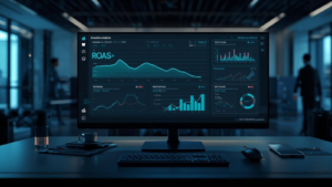
Dashboards give organizations more and more visibility into performance, but visibility is not the same as insight. A management team may have access to revenue, conversion, margin, cost per click, customer value, inventory turnover, return ratios, and channel performance without it becoming clear which decision should follow from that. The amount of available data is growing faster than the quality of interpretation. This creates a situation in which dashboards look professional, while decision-making remains dependent on discussion, experience, and uncertainty.
The problem is not data itself. Data makes performance visible, compares periods, and exposes deviations that would otherwise remain hidden. The limitation arises when dashboards are built as collection points for figures instead of as support for choices. A dashboard that shows a lot can provide little direction. A dashboard that shows less, but explains more clearly what is changing and why it is relevant, can actually accelerate decision-making.
More Data Does Not Automatically Increase Insight
The temptation to add more data is understandable. When a decision feels uncertain, extra information seems to reduce the distance to certainty. An extra KPI, an extra chart, or an extra filter gives the feeling that reality is being represented more completely. Yet insight does not arise from completeness alone. Insight arises when information is connected to a decision that needs to be made.
A dashboard without a decision question automatically becomes a storage place for measurement points. The figures are technically correct, but their function remains unclear. Revenue can rise while margin declines. Conversion can improve while customer quality deteriorates. A channel can deliver a lot of volume while the operational burden grows disproportionately. Without clear decision context, these signals continue to exist side by side. Management sees movement, but lacks direction.
The first shift therefore lies in the question of what the dashboard exists for. An operational dashboard must quickly make deviations visible. A strategic dashboard must support consequences for priority, budget, and capacity. A commercial dashboard must show which performance is scalable and which performance mainly appears incidental. When those functions are mixed together, KPI overload emerges. Not because too much data exists, but because the data has no clear task.
The difference between information and decision-making becomes visible when figures are linked to their actual function:
| Dashboard Function | What It Makes Visible | Decision Connected to It |
|---|---|---|
| Operational control | Deviations in campaigns, feeds, costs, or conversion | Adjust, correct, or temporarily pause |
| Commercial assessment | Return per channel, segment, or product group | Shift budget or limit scalability |
| Strategic steering | Structural development of margin, customer value, and growth | Determine priorities for the longer term |
| Organizational alignment | Differences between marketing, sales, finance, and operations | Define definitions, ownership, and responsibilities |
This distinction prevents a dashboard from trying to be everything at once. A management dashboard does not have to show every operational detail. An operational dashboard does not have to include every strategic implication. By separating the function, it becomes clear which information is necessary and which information mainly adds visual noise.
KPI Overload Arises From Unclear Decision Logic
KPI overload usually does not start with a conscious choice for complexity. It arises because teams keep wanting to answer a new question without removing old measurement points. A campaign gets additional channel statistics. An online store dashboard gets additional product dimensions. A management report gets additional comparisons with previous periods. Each element is defensible in itself, but together they create an environment in which the user first has to determine which figures matter before the actual decision can be made.
The core of KPI overload is not that people have too little analytical ability. The core is that the decision structure is missing. When it is not clear in advance which KPI is leading when signals conflict, discussions keep returning. Rising conversion appears positive, but may be less valuable when the average order value declines. A lower cost per acquisition appears favorable, but can be misleading when retention remains weak. Without hierarchy in the KPIs, discussion arises about interpretation instead of decision-making about action.
More data only reduces uncertainty when it is clear in advance which decision the data must support.
That hierarchy should not only emerge during the meeting. A dashboard must make visible which signals are leading and which signals are supporting. Otherwise, the work shifts from analysis to negotiation. Marketing defends reach, e-commerce defends revenue, finance defends margin, and operations defends feasibility. Each perspective is relevant, but without decision logic, perspectives become competing truths.
Management Information Must Structure Uncertainty
Decision-making will always take place under uncertainty. No dashboard can fully predict how market behavior, competitive pressure, inventory positions, customer preferences, or advertising auctions will develop. The value of management information therefore does not lie in removing all uncertainty. The value lies in structuring uncertainty, so it becomes clear which variables are important and which assumptions sit behind a decision.
A good dashboard does not only show what happened, but also which uncertainty remains open. Rising revenue can result from better demand, higher advertising pressure, temporary pricing, or seasonal effects. Without distinction between those causes, the figure remains superficial. The revenue increase is then seen as performance, while it is not yet clear whether the development is repeatable, profitable, and scalable.
Management information becomes stronger when figures are linked to explanatory context. Not every context has to be in the dashboard itself, but the structure must allow room for interpretation. A deviation without explanation is a signal. A deviation with cause, impact, and action option becomes a management instrument. That difference determines whether a dashboard only reports or actually supports decision-making.
Dashboards Without Ownership Lose Meaning
A dashboard is never neutral when definitions are unclear. Someone determines which data is used, how conversion is measured, which period is relevant, and which exceptions are excluded. When that ownership is not explicitly defined, there is a risk that dashboards continue to exist technically while their meaning slowly shifts. The figures are still viewed, but nobody is certain whether they still describe the same reality as when the dashboard was built.
This happens especially in organizations where dashboards have been expanded over time. A report starts with a few core figures and then grows along with new campaigns, markets, systems, and stakeholders. Fields are added, filters remain in place, old definitions are reused, and new data sources are connected. Without periodic maintenance, a dashboard emerges that is historically explainable, but less sharp from a management perspective.
Ownership therefore means more than technical management. It is about responsibility for meaning. Who determines whether a KPI is still relevant? Who may change a definition? Who checks whether a dashboard still aligns with current commercial priorities? Without these roles, management information becomes a shared responsibility without a clear owner. That sounds safe, but often leads to slowness.
A dashboard remains useful when three forms of ownership are explicitly organized:
- content ownership over definitions, KPI hierarchy, and interpretation
- technical ownership over data sources, integrations, and data quality
- management ownership over the decisions that should follow from the dashboard
This division prevents every problem from being treated as a technical problem. A faulty integration requires technical repair, but an unclear KPI hierarchy requires a management choice. A dashboard can only support decision-making when these responsibilities do not get mixed up.
Decision-Making Requires Less Noise and More Consequence
Noise arises when dashboards show too many signals that are not directly connected to consequences. A chart can be visually appealing, but not change a decision. A KPI can be interesting, but not influence priority. A comparison can be striking, but not justify action. When such elements remain in place, the cognitive load of the dashboard grows. The user has to separate again and again what is relevant from what is decorative.
A dashboard becomes stronger when every component has a consequence. If a KPI turns red, it must be clear what that means. Is budget lowered, is a campaign investigated, is a feed checked, or is a channel temporarily limited? Without action logic, color coding turns into visual unrest. The dashboard then warns, but does not steer.
A dashboard that does not organize consequence moves decision-making into discussion instead of supporting it.
That difference is important for management teams working under time pressure. They do not need more screens, but information that forces the right discussion. When figures only describe what happened, the meeting remains stuck in looking backward. When figures indicate which choice is on the table, attention shifts to priority. The dashboard then becomes not a reporting object, but a decision-making instrument.
From Measuring to Weighing
The step from dashboard to decision-making requires organizations not only to measure, but also to weigh. Measuring makes performance visible. Weighing determines which performance carries more weight when signals contradict each other. That is the point where data-driven working becomes mature. Not because everything is measurable, but because measurable information is connected to business logic.
An organization that only measures remains dependent on separate indicators. An organization that weighs makes explicit which outcome is more important. Growth can be subordinate to margin. Volume can be subordinate to customer value. Conversion can be subordinate to retention. These choices are not purely analytical, but they must become visible in the way dashboards are structured.
The transition from measuring to weighing requires fixed decision rules. Those rules do not have to be rigid, but they must give direction to interpretation. Without decision rules, every dashboard is read again from the perspective of the person at the table. With decision rules, consistency emerges. The discussion then becomes less about which figure is right and more about which action fits the situation.
Functional decision rules can, for example, define when a deviation deserves attention:
- a KPI is only discussed when the deviation is large enough to affect budget, capacity, or risk
- channel performance is assessed on margin and customer value, not only on volume
- a dashboard change is only added when the corresponding decision has been explicitly named
These rules reduce interpretation noise. They ensure that dashboards do not keep growing out of curiosity, but are maintained from the perspective of decision-making. That does not make the information poorer, but more usable.
The Role of Dashboards in Commercial Steering
Commercial steering requires dashboards that translate performance into direction. This means that revenue, margin, costs, and customer value are not treated as separate blocks. They must show in connection which growth is healthy and which growth mainly puts pressure on the system. A channel that delivers revenue quickly but structurally causes low margin requires a different interpretation than a channel with lower volume but higher customer value.
That connection is especially important for organizations that manage multiple channels, product groups, or countries. Management information must then not only show where performance is good or bad, but also where decisions influence one another. A budget shift toward a better-performing channel can deplete inventory faster. Higher advertising pressure can increase the support burden. A sharp promotion can increase revenue and lower margin. Without these connections, decision-making remains too narrow.
A dashboard only supports commercial steering when it makes the consequences of choices visible. Not every consequence can be predicted exactly, but the relevant dependencies must be visible. This changes the dashboard from a collection of results into a map of decision space. Management sees not only where the organization stands, but also which choices are likely to create pressure on other parts of the chain.
Why Less Data Sometimes Leads to Better Decision-Making
Less data does not mean less knowledge when the remaining information has been chosen more sharply. A dashboard with ten measurement points directly connected to decisions can have more value than a dashboard with fifty measurement points without hierarchy. The first forces interpretation. The second asks the user to interpret. That difference determines how much mental space remains for the real decision.
Reducing KPIs is not cosmetic cleanup. It is a management intervention. By removing measurement points, the organization states which signals are no longer central. That can be sensitive when teams have become used to their own dashboards and their own definitions. Yet that step is necessary when management information is no longer intended as a registration of everything that is measurable, but as support for choices that give direction.
The goal is not to hide uncertainty. The goal is to make uncertainty manageable. Dashboards must show where certainty exists, where assumptions lie, and which choice has consequences. More data can help with that, but only when the extra information strengthens the decision logic. When extra data mainly adds new interpretations without giving direction, the quality of decision-making declines.
Decision-Making Begins Before the Dashboard
The quality of a dashboard is determined before the dashboard is built. The most important choices are about definitions, priorities, responsibilities, and decision rules. Which outcome weighs more heavily when growth and margin conflict? Which KPI determines whether a channel is scalable? Which deviation requires immediate action and which deviation belongs to normal variation? Without answers to those questions, a dashboard mainly becomes a technical translation of management ambiguity.
For OnlineMarketingMan, the value of dashboard decision-making therefore does not lie in collecting more figures, but in building a better connection between data and choice. Management information should not prove that a lot is being measured. It should help determine which action is logical under uncertainty. That requires discipline in what is shown, what is left out, and which consequence is connected to figures.
An organization that uses dashboards in this way shifts from reporting to steering. Data remains important, but gets a clear role. KPIs are no longer treated as separate performances, but as signals within a decision-making process. This creates less noise, more consistency, and a sharper conversation about what the organization really needs to do. Not because the dashboard knows everything, but because it makes the right uncertainty visible.
Related Articles on Strategy, Automation and Growth:
WHY FORECASTING HELPS WEIGH UNCERTAINTY, RISK, AND PROFIT IMPACT.

Read why dashboards only create value when data helps teams weigh uncertainty, risk, and profit impact more clearly.
WHY ATTRIBUTION MEANS LITTLE WITHOUT MARGIN, CUSTOMER VALUE, AND PROFIT.

Read why reporting gives little direction when attribution is not connected to margin, customer value, and profit contribution.
WHY MORE KPI’S DO NOT AUTOMATICALLY IMPROVE DECISION-MAKING.
Read why more KPIs do not automatically create better choices and profitable growth requires sharper measurement logic.
OnlineMarketingMan
Build. Automate. Expand.